Native-UI
Native-UI - React Native Design System
A production-grade React Native design system - native-feeling components on iOS and Android.
Developer Tool




About
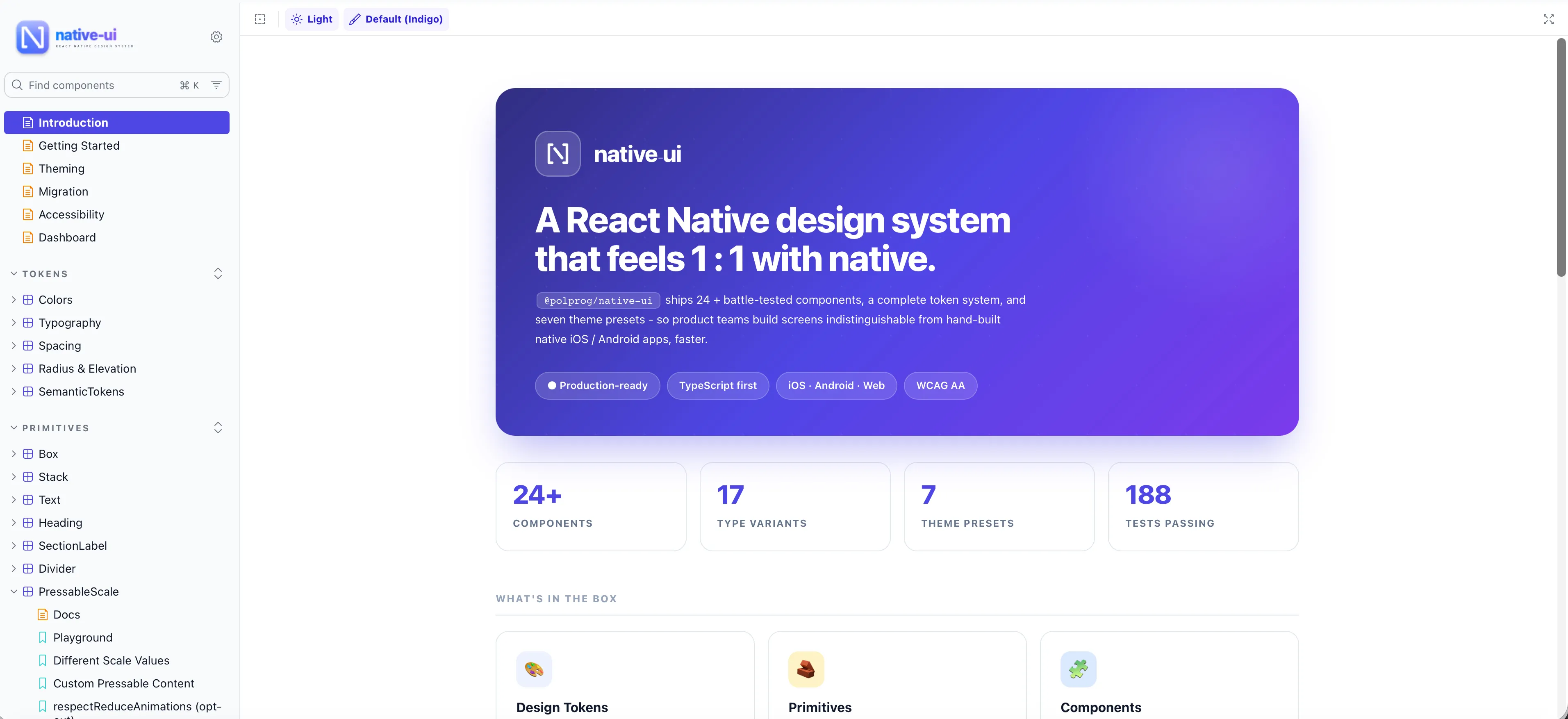
Native-UI is a React Native design system built around tokens, themes, and accessibility-first primitives. It ships 32 components and 9 layout primitives - Button, Input, Select, BottomSheet, HeaderBar, ListItem, Toast, Modal, and more - each behaving correctly on both iOS and Android, with full light / dark theming, reduce-motion support, and typed APIs. Published as @polprog/native-ui on npm, now public under the MIT license.
Key Features
Token-based Theming
Every surface - colour, spacing, radius, typography, shadow - is a named token. Switch light / dark / custom themes via a single provider; components only read tokens, so one change propagates system-wide.
40+ Components & Primitives
32 components - Button, Input, Select, BottomSheet, HeaderBar, ListItem, Modal, Toast, Switch, Checkbox, Radio, Card, Avatar, Badge, Chip, Spinner, Skeleton, SearchBar and more - plus 9 layout primitives (Box, Stack, Heading, Text, Divider).
Native-feeling Platform Behaviour
iOS uses SF-native press feedback and sheet sizing; Android uses ripple and Material elevation. Same props, correct platform behaviour - no platform code in your app.
Accessibility-first
Every interactive component ships with labels, hit-slops, focus order, screen-reader roles, and reduce-motion respect. Override any default per instance when you need to.
Fully typed API
100% TypeScript. Exhaustive prop types, variants, and theme contracts autocomplete in your editor - so wrong usage is caught before runtime.
Zero Runtime Dependencies
No styling libraries, no heavyweight UI frameworks - just React Native itself plus a thin theme provider. Minimal install footprint, no version-lock risk.
Token-based Theming
Every surface - colour, spacing, radius, typography, shadow - is a named token. Switch light / dark / custom themes via a single provider; components only read tokens, so one change propagates system-wide.
40+ Components & Primitives
32 components - Button, Input, Select, BottomSheet, HeaderBar, ListItem, Modal, Toast, Switch, Checkbox, Radio, Card, Avatar, Badge, Chip, Spinner, Skeleton, SearchBar and more - plus 9 layout primitives (Box, Stack, Heading, Text, Divider).
Native-feeling Platform Behaviour
iOS uses SF-native press feedback and sheet sizing; Android uses ripple and Material elevation. Same props, correct platform behaviour - no platform code in your app.
Accessibility-first
Every interactive component ships with labels, hit-slops, focus order, screen-reader roles, and reduce-motion respect. Override any default per instance when you need to.
Fully typed API
100% TypeScript. Exhaustive prop types, variants, and theme contracts autocomplete in your editor - so wrong usage is caught before runtime.
Zero Runtime Dependencies
No styling libraries, no heavyweight UI frameworks - just React Native itself plus a thin theme provider. Minimal install footprint, no version-lock risk.