
Token-based Theming
Every surface - colour, spacing, radius, typography, shadow - is a named token. Switch light / dark / custom themes via a single provider; components only read tokens, so one change propagates system-wide.


React Native Design System
A production-grade React Native design system - native-feeling components on iOS and Android.
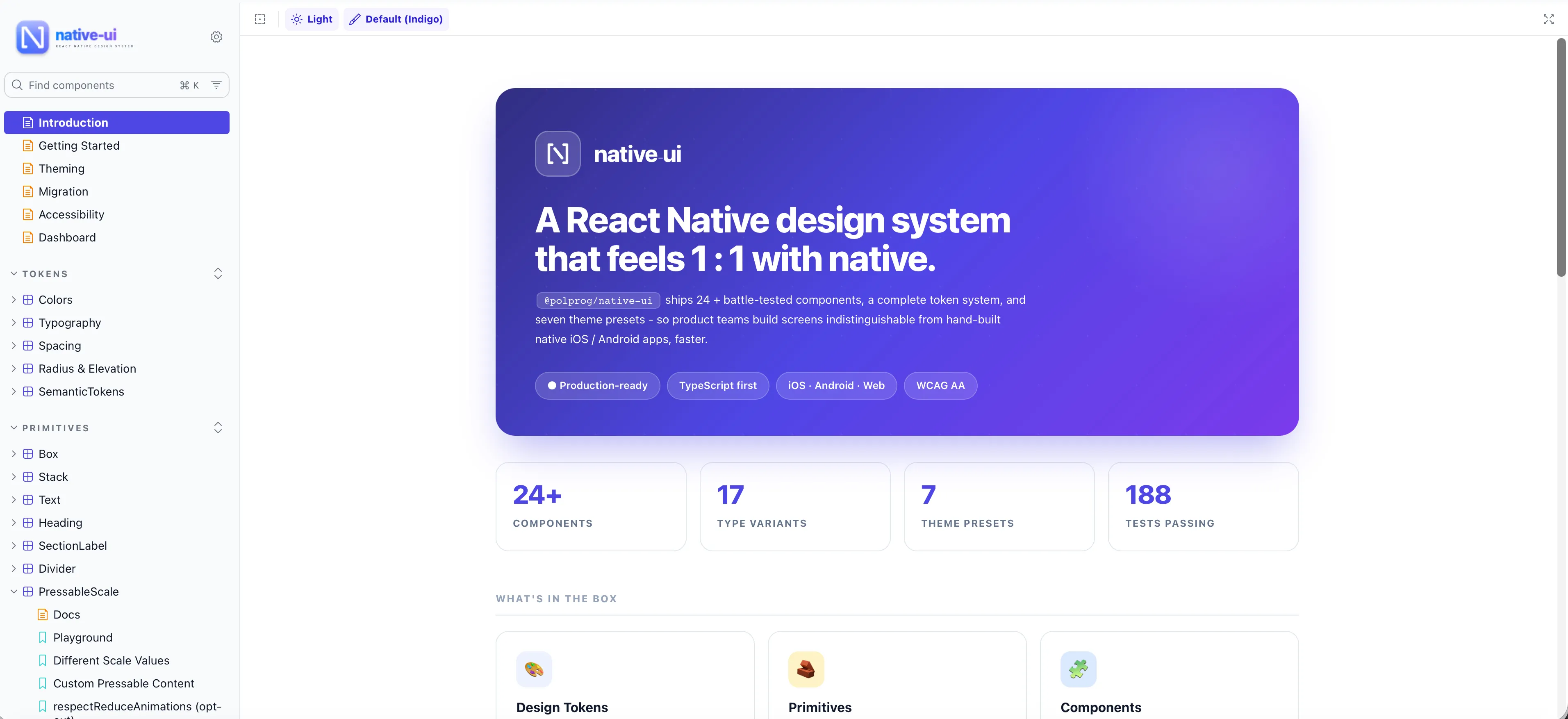


Native-UI is a React Native design system built around tokens, themes, and accessibility-first primitives. It ships 32 components and 9 layout primitives - Button, Input, Select, BottomSheet, HeaderBar, ListItem, Toast, Modal, and more - each behaving correctly on both iOS and Android, with full light / dark theming, reduce-motion support, and typed APIs. Published as @polprog/native-ui on npm, now public under the MIT license.
The most important capabilities, explained in practical terms.
Every surface - colour, spacing, radius, typography, shadow - is a named token. Switch light / dark / custom themes via a single provider; components only read tokens, so one change propagates system-wide.
32 components - Button, Input, Select, BottomSheet, HeaderBar, ListItem, Modal, Toast, Switch, Checkbox, Radio, Card, Avatar, Badge, Chip, Spinner, Skeleton, SearchBar and more - plus 9 layout primitives (Box, Stack, Heading, Text, Divider).
iOS uses SF-native press feedback and sheet sizing; Android uses ripple and Material elevation. Same props, correct platform behaviour - no platform code in your app.
Every interactive component ships with labels, hit-slops, focus order, screen-reader roles, and reduce-motion respect. Override any default per instance when you need to.
100% TypeScript. Exhaustive prop types, variants, and theme contracts autocomplete in your editor - so wrong usage is caught before runtime.
No styling libraries, no heavyweight UI frameworks - just React Native itself plus a thin theme provider. Minimal install footprint, no version-lock risk.
A clear path from the official source to your first successful workflow.
Use one of the official links available for your device or browser.
Follow the store instructions or open the web application. No third-party installers.
Review the options, choose your preferences and start with the core workflow.
A transparent look at the core technologies used to build and maintain this product.