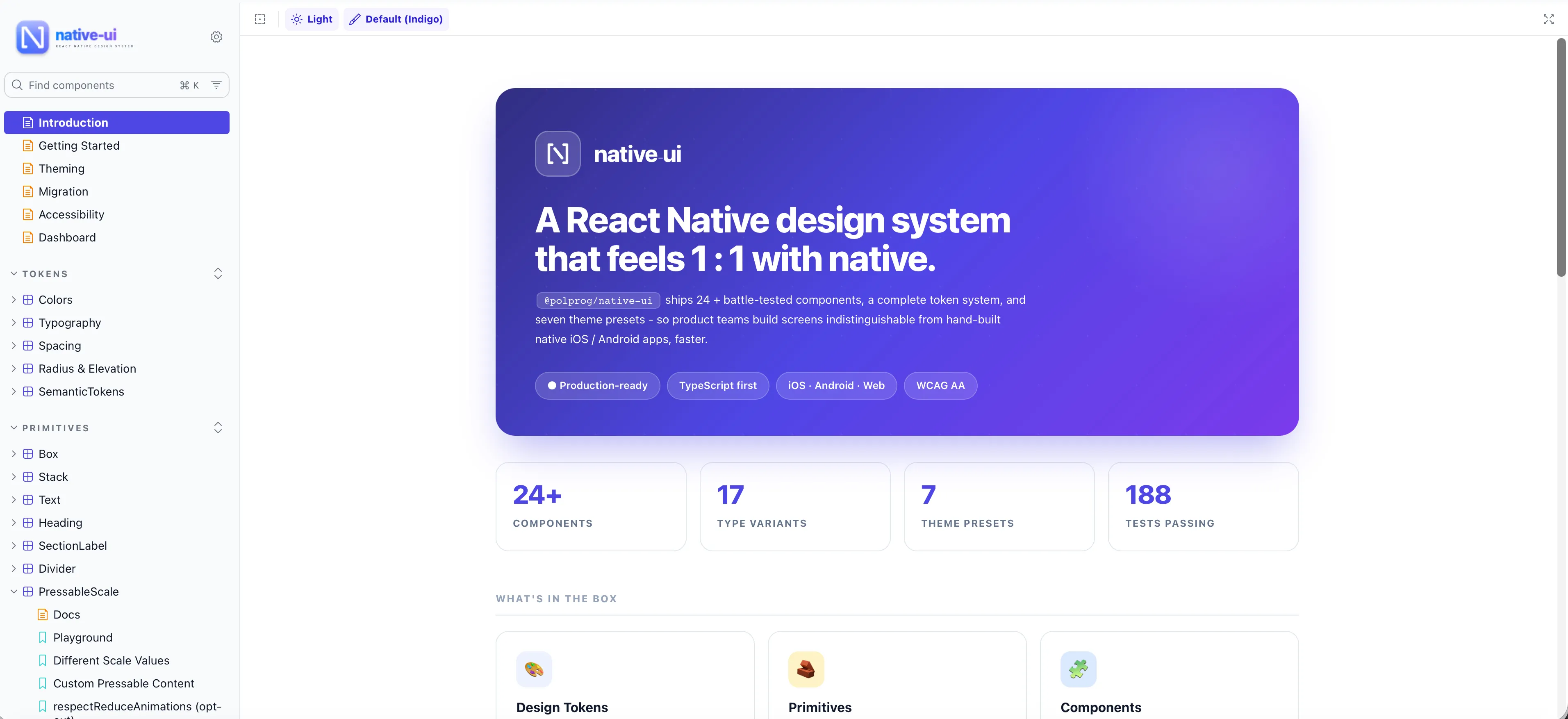

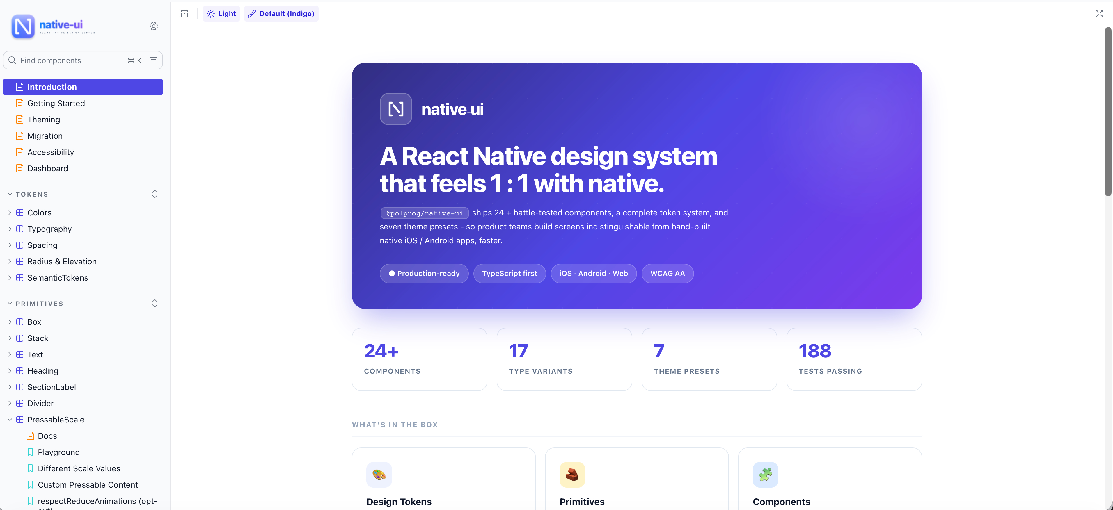
@polprog/native-ui has been published to npm. Native-UI is a React Native design system built around tokens, themes, and accessibility-first primitives.
What is in the box
32 components - Button, Input, Select, BottomSheet, HeaderBar, ListItem, Modal, Toast, Switch, Checkbox, Radio, Card, Avatar, Badge, Chip, Spinner, Skeleton, SearchBar and more - plus 9 layout primitives (Box, Stack, Heading, Text, Divider). Each component is 100% TypeScript, fully themeable, and behaves correctly on both iOS and Android.
Platform-correct behaviour
iOS uses SF-native press feedback and sheet sizing; Android uses ripple and Material elevation. Same props, right behaviour per platform - no platform code in the app.
Accessibility first
Every interactive component ships with labels, hit-slops, focus order, screen-reader roles, and reduce-motion support. Every default can be overridden per instance.
Open source
Released under the MIT license. Install with npm install @polprog/native-ui. Documentation, changelog, and roadmap are available at Native-UI.com.